|
|
||
Click on a thumbnail to enlarge it. Use your browser's "BACK" button to return to this review when done. |
||
| Type of Product | ||
Microsoft Publisher 98 is a desktop publishing program for
small or home-based businesses, students, nonprofits, and families. Users
can create newsletters to flyers to greeting cards to Web sites. There are step-by-step wizards and templates that make it easy to create
publications and Web sites even if you have no design experience. Design
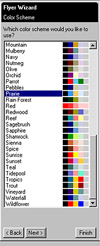
Sets and Color Schemes enable you to create a consistent look across a
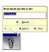
wide variety of printed material. And there are a variety of Help features
if needed. The program was introduced in 1991 and more features have been
added with each version to make it easier to use and more efficient. With
this upgrade, Microsoft has added impressive design and editing improvements
that make desktop publishing a snap with Publisher. Price:
$79.95 with a $20 rebate for upgrades. Web site http://www.microsoft.com
 |
||
| User Level | ||
| This program was designed for beginner PC users who have little or no experience in design,
desktop publishing, or computers in general. The wizards and templates really make it a no-brainer to
produce documents. And anyone at all familiar with Microsoft Office or Word will have no problem as Publisher looks
even more like Office than ever, and has included more of its features such as the on-the-fly spelling correction
used in Word; multilevel undo; the same toolbars; and an animated assistant that some people love to hate. Intermediate users should appreciate its Web features. What about advanced users? I don't know about all advanced users, but I can relate how I use the program. Have you ever ever had that desktop publishing job that the client wanted like yesterday; you didn't have time for the job; you didn't want to start from scratch to design it in Photoshop or Pagemaker; you didn't want to sort through all your CDs for the right graphics and fonts; the client didn't know what they wanted, exactly; you didn't know either and therefore had difficulty starting the project; it wasn't a job that demanded the detail or expertise that you would want for Vogue Magazine; and you had computer block: you just sat there and stared at a blank screen. Well, that happened to me recently. All the information I had was that they wanted a flyer that was cute and cuddly for a home nursery for babies; I thought about Microsoft Publisher. I used a predesigned publication and the wizard to get me started. I then went in and made changes to certain features. There were enough graphics available in Publisher that I had no problem finding cute and cuddly images. I started to enjoy the job. I was happy with the finished product and so was the client. I find Publisher also useful for clients who have small jobs; little money; want inexpensive color documents; and want to use predesigned paper such as from Paper Direct. Publisher includes a variety of predesigned documents using paper from Paper Direct that help you produce professional looking color documents in no time that can then be inexpensively xeroxed. |
||
| New Features | ||
|
||
| Review | ||
|
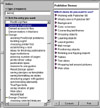
The program is easy to install. You can choose the typical install which will select all the fonts and graphics needed to create the publications in Publisher's Catalog, or a custom install where you can select additional fonts. The interface is organized and intuitive. Publisher's Catalog is the
entry point to any publication. You can ea Zoom tools allow you to zoom in and out from actual-size to full-page
views, or in small The Publisher 98 interface now includes Office Command bars that are easy to customize. You can drag and drop toolbars onto existing menus or create custom toolbars. They include menu controls as well as feature icons. The menu controls invoke drop-down menus and provide you with several more options such as tear-off menus and shortcut menus. All the features in Publisher are too numerous to describe, but below is a discussion of those features of Publisher 98 that I felt were useful. I have already listed some of them in the New Feature section, but I have included additional material for beginner users who could use more detail.
|
||
| Personal Comments | ||
| When I started this review, I had not intended to make it a Review of the Month. I was familiar with previous versions of Microsoft Publisher and looked forward to the new review. As I tested each new feature, and I did use all of the additions, I decided to use it as the monthly choice. Of course, if you want to create your own distinct publications, you can use Adobe Pagemaker or Corel Ventura. But that does not diminish what Publisher can do. It is an excellent program for beginners. For know-nothings who want to create dependable results, it will walk you through each step. There is no retraining for users who upgrade, and new users who are familiar with Word or Excel will find the package effortless. It is well-organized; includes an abundance of desktop publishing features as well as word-processing features; has visual elegance; and advanced formatting and convenience make it worth consideration by design professionals. Pagemaker or Ventura can be overkill for some design jobs, and Microsoft Publisher 98 is a handy program to have around for those types of jobs that I described in the User Level section. With Publisher 2000 in a beta version, you should be able to purchase Publisher 98 for a price that would make it a nifty Christmas stocking stuffer. | ||
| Wish List | ||
|
||
| System Requirements | ||
| Processor: 486 or higher Operating System: Windows 95 or Windows NT Workstation 4.0 or later Memory: 8MB for Windows 95 and 16MB for Windows NT Hard Disk Space: Typical installation 109MB; minimum installation 24MB CD ROM drive VGA or higher resolution video adapter; Super VGA, 256-color recommended |
||
|
Graphics: DeMorgan WebSpice 1,000,000 Page Design Edition |
||
